IPS Photo Challenge – Week 3
I’m beginning to see some common threads. I really need to work on composition to heighten emotional impact and focus on getting the exact exposure to maintain maximum interest. I’ve got one more week to work on it! But for now, here is week three.
Day 11: Breakfast
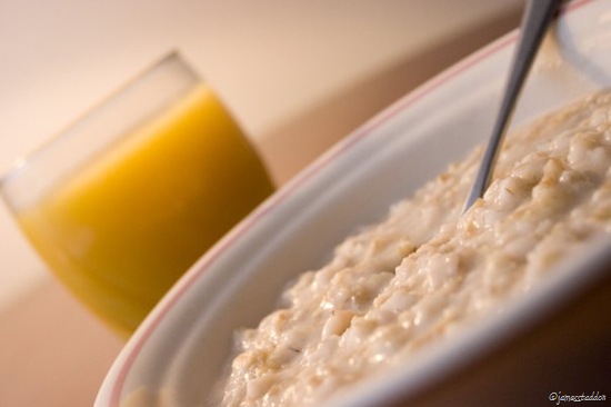 Simplicity was the goal here. I wanted to create a picture of a bowl of oatmeal like you would find on a breakfast menu of some classy restaurant. The lighting helps to achieve this end.
Instructor Review and Critique: “Very nice! I love the cozy, intimate feel of the low perspective. You’ve done a really good job with the exposure, drawing attention to the oatmeal. You need to watch the color of the orange juice, it needs to be more orange/yellow, less orange/brown/green.
I don’t like the extreme tilt. This is especially true when you have a cup with liquid. You don’t loose the simplicity or interest by pulling the image back level. This would also allow you to add the spoon handle back into the shot–creating the feeling that this is the viewer’s bowl.”
Day 12: Pinecone
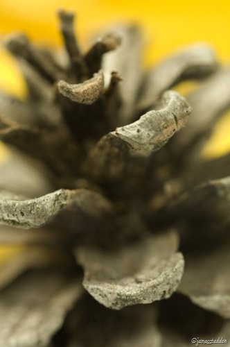 I decided that this assignment would be a fun one to shoot with a macro lens. I used a tripod because of intricate subject positioning and low lighting. At first, I didn’t like the background, so I found a yellow leaf and set it in behind the pinecone where it would be out of focus and add some color and character to the picture.
Instructor Review and Critique: “Wow! Nicely done. I love the texture and light on this unique perspective of a common pine cone. You’ve got great
shadow detail and depth.
“The actual cone disappears a little too quickly into the background. I’d like to see a little more of the individual scales. I’m thinking a smaller aperture (f/16 or f/22) would do the job.”
I wish I could have taken pictures for days 13 and 14. However, as my schedule was very full with finishing things up and traveling, I didn’t make time for it.
Day 15: Autumn
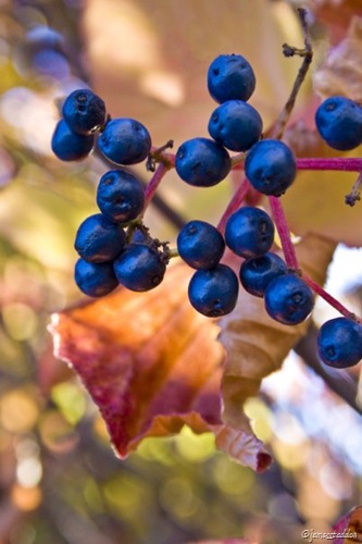 I know that this picture might not represent ‘autumn’ to the average mind. However, as used by the French farmers of the 16th century, the word autumn refers to full maturity: the stage in which a plant, cultivated or wild, bears it’s precious fruit. In this picture, I love the tell-tale signs of a near-approaching winter: slightly over-ripe berries, subdued lighting, and golden remains of dying leaves. If I had the chance, I would crop the right and top sides. Unfortunately, my lens didn’t allow me to focus any closer.
Instructor Review and Critique: “This shooting assignment is highly subjective and is therefore one of the hardest of the 20 you’ll face during this Challenge. It is really important for your image to move beyond ‘Autumn’ things and capture the emotional ‘feel’ of autumn.
“You’ve captured a sharp image that conveys the fruit of autumn. I love the highlights and shadow detail. You do have some distractions in the background, most notably the stripe of light poking out just behind and to the right of the leaf.
“To perfect a shot like this, I’d probably pluck the branch of berries so I could set up the shot with a better background and better framing. Taping the branch to a microphone stand would do the trick.
“Your caption is way too long and belittles folks who didn’t know the origin of the word ‘autumn,’ not really a good start. It should be shortened to say, ‘Ripe wild berries often remind me of how 16th century farmers used the word ‘autumn’ to refer to the time when crops had reached full maturity. A time of harvest and completion; golden summer fading into winter.'”
Personal Remarks: You are very right! Thank you so much, Will, for your precise, helpful and honest critiquing.
Great shots James! Love the pinecone in particular! thanks for sharing!
Beautiful photography, bro! I really like all three of them!
I can almost smell that oatmeal…:-)
Thanks again for sharing your pictures and the associated stories and critique.
Are you getting a critique for the last one? I’m waiting for that so I cam make my critique. 🙂
Allen
OK, here goes:
Breakfast:
The tipped picture bothers me because I immediately have a feeling that I am seeing an advertisement, and that make it impersonal. I think that if you had left the image straight, the gently diagonal line of the table’s edge would have added interest. (I would also have made that line pointing up to the right, not down to the right.) This photo looks extremely professional. I like how some of the oatmeal is in focus, while the oatmeal in the foreground fades gently out of focus.
Pinecone:
I agree with the instructor. I like that the leaf in the background provides a gently mottled yellow, not a solid color. I gives a soft warmth that I don’t think you could have achieved any other way.
Autumn:
The clear leaf just behind the berries feels distracting. That said, the blue against the red leaf is much better than blue against the greenish color in the background. I love the way the berries display several shades of blue. Each one has an individual character.
It’s too bad that you lost a couple days. I hope you find more time to shoot soon!