IPS Photo Challenge – Week 1
When I heard about the new 4-week photo challenge the Institute in Photographic Studies was offering, I quickly decided to join up! This continuing education opportunity is designed to keep the shooting pressure on for former IPS students by requiring the submission of one picture a day for one complete month (not including weekends). The benefit is that each picture will be reviewed and critiqued by a pro instructor, giving valuable feedback, encouragement, and direction! For those aspiring photographers reading our family blog, I am posting my submissions here in hope that you might also learn from the priceless insights of skilled critiquing.
Day 01: Leaf
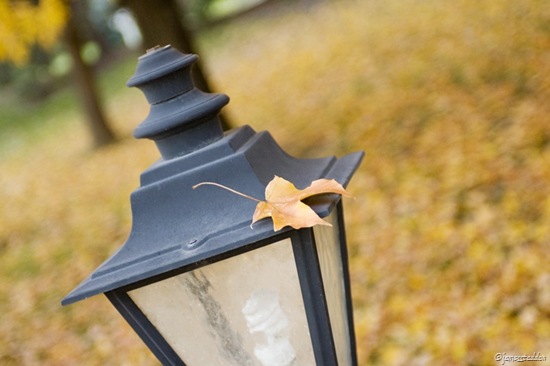
It wasn’t too hard to find a colorful leaf. But this one, precariously yet trustingly resting upon the top of a lamppost, rose above the rest in singularity. I had to stand on the back of my companion to get the right vantage point.
Instructor Review and Critique: “I like how sharp this image is, as well as the way the color of the leaf is replicated in the tones of the background. Shifting your perspective higher definitely made this shot.
“Unfortunately, your subject (the leaf) isn’t what first attracts the viewer’s attention. The lamp is just a sharp as the leaf, but has the advantage of being a little brighter and resting on the third. This combination draws too much attention away from the leaf and ruins the effect.
“I’d recommend moving in closer and framing the shot with the leaf on the lower left-hand third and framing the background with the lamp. (This should place the leaf back into a stronger position and eliminate some distractions in the background.”
Day 02: Bicycle
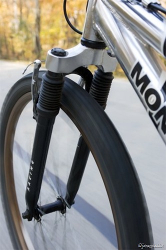
Biking has always been an enjoyable pastime of mine. Bring along a camera, mix the warmth of Indian Summer with the color of Autumn-up-north, and you will find the emergence of the ultimate November photo shoot.
Instructor Review and Critique: “Cool shot. I really like the different/dangerous perspective you’ve captured! You’ve got great highlights and good shadow detail, but I’d like to see a little more saturation.
“You’ve cropped the front tire a bit tight and the shot is a little soft–lacking sharpness. I’m assuming the framing is limited by your lens options, but I would like to see you bring the camera a little
closer to the bike, thus adding more depth to the shot while maintaining the dynamic perspective.
“To fix the sharpness issue, I’d suggest you push the ISO to the 400-800 range to allow you to use a larger f/stop # and faster shutter speed.”
Day 03: Industrial Building
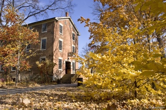
Graue Mill, established in 1852: a historic landmark of pioneer industry. There are not too many other industrial buildings in the area, so this one had to suffice. I would have tried capturing the the waterwheel working hard away in the back if it hadn’t been for the brilliant leaves and friendly sunlight of the front.
Instructor Review and Critique: “Very awesome! I really like the perspective you’ve taken with this shot. You’ve gotten very low and framed the mill with the tree branches, creating a shot that is very pleasing–especially with the contrasting blue sky in the background. Well done!
“My only concern is the branches that create a visual merger with the side of the building and stairs, and even intersect with the sign. A clearer, cleaner swath of blue separating the building all the way down would have been better. (I’d have tried shifting left or bending the offending branches down.)”
Day 04: Coffee Cup

I searched high and low for a decorative tea cup but the only photogenic liquid-holder I could find was, of all things, a Starbucks coffee mug. Because of my convictions against coffee, I filled it with hot chocolate and, satisfied with my sacrilegious act, began shooting away.
Instructor Review and Critique: “Cool shot! You’ve taken an interesting perspective on this shot. I like the intimacy/closeness of the coffee cup, and the tilt adds some drama. You’ve blown out your highlights a little too much, but have done a good job pulling the shadows back in for a the all-important high contrast aspect of B&W.
“It feels like you’ve included a little too much of the handle and not enough of the cup. I’d like to see this shot framed with the S’bucks logo in the lower left third–filling the frame and bringing more attention to the cup.”
Day 05: Happy
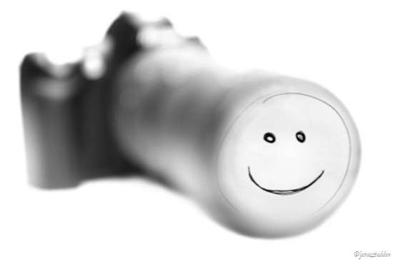
My camera and I are very happy when we shoot together; but it is very difficult to see a smiling camera! To create this picture, I drew a happy smiley face on a white piece of paper and taped it up a few feet in front of a camera and lens laying on a white table. Then I shone a bright light on the smiley face and positioned my camera in such a way that I could clearly see the reflection in the lens. I used a narrow aperture to blur up the camera, focused on the reflection to highlight the smile, and overexposed to blow out leftover, detracting glare. The last steps were in Photoshop where I turned it B&W, heightened the contrast, and tweaked it to perfection.
Instructor Review and Critique: “Very creative!! This is an awesome technique that I’ll definitely keep in my back pocket. However, the shot looks a little too unreal. This is mainly due to how far out of focus the camera and lens are in relation to the smile.
“You’ve blown the highlights a little too much and there is very little shadow detail. The sharp black lines of the smiley face coupled with the lack of shadow detail on the camera body contributes to the unreal feel. Unfortunately, this communicates ‘Smile’ more than ‘Happy.'”
I hardly see how they found anything wrong with those, James! The smiling camera is an absolutely ingenious idea. But my favorite was the leaf on a lamppost – you captured its delicate pose quite skillfully. 🙂
nice work
Allen’s response/critique (and remember that I only took one semester of photography):
1 – Leaf:
I differ and think the leaf should be in the lower right-hand third. Neat angle – I have never seen the top of a lamp post like that!
2 – Bike:
I think a little more contrast would be good here. I like the indication of high speed – makes the photo alive. A agree about the f/stop – a larger opening and a faster shutter might have made the spokes look better. In addition, if you had decreased the angle (by bringing the camera closer to the bicycle) you could have gotten a deeper depth perceptive by focusing on a certain point on the tire and letting the rest be slightly out of focus – but then again, it’s all blurred anyway.
3 – Building
I pretty much agree with the critique given. I like the contrast with the shading between the two visible sides of the building.
4 – Coffee:
The Starbucks logo provides a nice startling contrast to the soft shadows and the delicious swirl of cocoa in the mug. A nice gentle tone, too. I agree about the framing.
5 – Happy:
I was very perturbed at the photo until I red your description! The camera is certainly very happy to see you. It is, as the critique mentioned somewhat unreal. A very creative shot! What did you use for your background?
Can’t wait to see your next set!
I should mention that I’ve been itching to pull out my SLR and have a go on my college campus – a very beautiful place with lots of old buildings. This might be just the provocation I needed to do it!
Awesome job James! I love the Starbucks mug hehe…you are an Amazing photographer! now I really want to take the IPS!=)
Very nice, James! I enjoyed viewing the pictures and reading the critiques. It is so helpful to see how each image could be improved.
The only picture that I didn’t think was awesome was the Starbucks cup. 🙂
Thank you so much Allen for your comments! It is great to have many different perspectives when a picture is critiqued. I hope you are able to get out and take some pictures with your busy schedule!
I enjoyed the pictures, as well as reading the way you got the effect and how it could be improved. I think you got all your picture taking talent from your father though!
I can think of nothing better to put inside a Starbucks mug than hot chocolate, running a close second would be herbal tea:-)
What creative pictures James. I enjoyed reading how you took them. The most unique one I thought was the picture of the bike. I’m looking forward to seeing more creative pictures.